
Discussing Blog Design in 5th Grade
I had a great day today. I got to talk about web design with 5th grade students. Ms. Bulsza invited me in to talk to the class about their blogs.
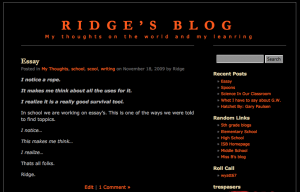
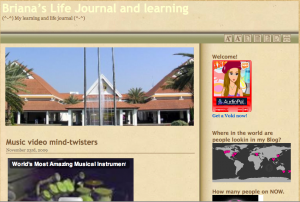
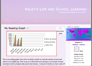
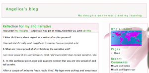 Over the past couple of weeks someone (OK…maybe me) taught them how to install embedded widgets on their blogs sidebars. What I found interesting is that I taught one girl in one class how to do it….two weeks later every kid in 5th grade has the most outrageous sidebar widgets on their blogs. Things that had nothing to do with education, their learning, or 5th grade…..the purpose of the blogs.
Now there are two ways to handle this situation. 1) You can stand up as a teacher and say, “OK, that’s it, no more chirping birds, or iPods playing songs, or games that make noises on your blog.” Or you could say 2) “Let’s have a discussion about web design.”
Now I’m not sure if Ms. Bulsza was expecting my approach, but the last thing I want to do is tell kids that they can’t make their blog….their blog. However, it is an opportunity to have a conversation about website design, as this blog/website belongs to them.
So here’s the lesson I did in about an hour today.
 1) I want you to go to your favorite website. Once there I want you just sit and look at the page and think about what makes this site, this page your favorite. Look at it like art work. What catches your eye? Why do you come back here time and time again.
2) Ask for volunteers to come up, plug their laptops into the projector and show the website they choose. Then have then talk about why this is their favorite website, and open it up to the class as well.
Here’s where we ended up today.
Youtube: What we liked about YouTube was that the best videos were right there for you to click on. They were little thumbnail images and you could easily see the title, how many people had watched them, and you knew where to click, as we talked about that blue is the color of links on the web.
 Club Penguin: We likes that it was simple, that you could easily tell that it was a site you had to join do to the “membership” button at the top. We liked that it had moving images on the home page. We really didn’t know what it was about, but the Disney over Club Penguin told us it was probably OK for kids. We also talks about colors and that most everything we design, from clothes, to websites, to art has at most three main colors. Club Penguin has Blue, White and Orange as their main colors on the site.
RuneScape: We liked that you could translate the site quickly. We liked that there were bullet points that told you what you could expect, what this site was about. We liked that there was a video right in the middle of the page that you could play and learn more about the site.
Facebook: We liked that it was simple. You either log in or you create an account…that’s it. The two colors that Facebook uses, Blue and White, are all over the site, so you always know when you are on Facebook.
 (Yes…all these sites are unblocked at my school…for just this reason…we can use them to learn.)
3) We then went to a news site. I choose the BBC to talk about how a news site looks. We agian talked about the site.
We liked that the BBC was “easy on the eyes” the colors were nice. We liked that the clock was on your time zone, we liked that you could easily tell when you were reading Top Stories and when you were reading Sports.
4) While on the BBC we talked about “above the fold” a term used in the newspaper era (only about 5 kids in the class had ever read a newspaper) that had made it’s way online. We talked about scrolling and how you do the best you can to get the most important content above the fold so viewers to your site don’t have to scroll to get to the content.
5) After this I gave them 5 minutes to go to their blogs and just have a look. Pretend you’ve never seen this site before, we know that people will spend on average 7 seconds on a site before decided to keep reading or leave the site. “What does your site say in 7 seconds?”
6) Ask for volunteers to bring their laptops up, plug them into the projector, and talk about their site. What do they like, what would they change after today. Then open it up to the kids and allow them to ask questions and give feedback about their blog.
 7) Get involved! After looking at 4 or 5 student blogs, we put Ms. Bulsza’s blog on the screen and had the kids talk about it. They liked the layout, liked that the content was above the fold, but felt the header image didn’t represent the class, that the blog talked all about the classroom but the header image didn’t fit.
Next up….my blog. I pulled The Thinking Stick up on the screen and let the kids give me feedback. They liked the newspaper layout, they liked the image in the middle of the screen, but they didn’t like the baseball bat or the fact that the site “Thinking Stick” wasn’t really about education.
“I expected to be reading about baseball” one student said…and they were right…..my image and even the name of this blog does not represent the content found here.
 8) Now that we’ve talked about blogs, and web design we gave the students 15 minutes to look and fix their blogs.
We never talked about sidebar widgets, we never talked about what you could or couldn’t have. What we did talk about was what makes a good website? We empowered the students to understand that a well designed website matters. It matters to your audience.
So that’s it….that and the fact I told the students in the next couple days I’ll be checking their blogs and giving them feedback on their blog designs. It’s not homework, it’s not required, but from the amount of students that wanted to stay in during recess to work on their blog design…I think they’ll be wanting to do some design work on their own. 🙂




Blog design in a grade 5 classroom: http://tinyurl.com/yhgbtxz
RT @iLEADCommunity: Blog design in a grade 5 classroom: http://tinyurl.com/yhgbtxz
RT @web20classroom RT @iLEADCommunity: Blog design in a grade 5 classroom: http://tinyurl.com/yhgbtxz
Discussing Blog Design in 5th Grade | The Thinking Stick http://bit.ly/7iSUFu
Starting early: Discussing Blog Design in 5th Grade http://bit.ly/57Unf7)
What an amazing lesson you helped those students discover for themselves! Taking the time to let them discuss and evaluate different websites, and then allowing students the opportunity to tweak their blogs according to standards they had ownership over is so powerful. Kudos to you!
Thanks!
It was fun to get down and geekie with the kids for awhile. Of course nothing we talked about for the hour had anything to do with the curriculum….or maybe it had everything to do with it. Not sure which and really don’t care. In the end I hope that the kids got something out of it. That they not only better understand how to build a better website for themselves, but also how to look at and “read” a website.
Regarding this: “Now there are two ways to handle this situation. 1) You can stand up as a teacher and say, “OK, that’s it, no more chirping birds, or iPods playing songs, or games that make noises on your blog.†Or you could say 2) “Let’s have a discussion about web design.—
I am convinced that this is metaphorically the choice we face in virtually EVERY aspect of education. Should we tell our students, “Do this,” (whether “this” is a math algorithm, behavior rule, length of a writing assignment, whatever) or should we actually engage the students in thinking and taking ownership of their own learning?
I love the path you chose and think it is, sadly, the path less traveled.
Yes…and my issue is I take that path a little to often. The other day I was doing a lesson on GarageBand with 4th grade and they started…as usual….talking about how they sound different then they think they sound. So we spent 15 minutes talking about how you actually hear yourself from inside your mouth and throughout your body (http://www.wanderings.net/notebook/Main/WhyDoesYourVoiceSoundDifferentRecordingPlayback)
Of course that wasn’t what we were doing, but it’s science…and a pretty cool thing to talk about. 🙂
I love it when we empower our students to make good choices and they never cease to amaze us.
This is what helps me keep passionate about working with students!
Agree…..I love it when we set bars that we think their is no ways they’re going to reatch them and then they do…with ease. I’m a firm believe that if you can truly get kids excited and engaged, the learning takes care of itself. It’s that way with blogs in Ms. Bulsza’s class right now….they would talk about blogs for days, months….um….yeah…their excited. 🙂
Discussing Blog Design in 5th Grade | The Thinking Stick http://bit.ly/8iuhDB
This post has been resonating in my mind for a few days now Jeff. Have shared web design with secondary school students in the past. It is good to allow the students the chance to think on issues regarding the user experience. Have you thought about Thinking Stick and the baseball bat since? Will you redesign in view of the students’ feedback?
I am rebuilding my own site at the moment. Still playing with the template. My blog is called “Watershed” and the title means something to me but not many people get it and are not familiar with the term ‘watershed’ in the historical sense. Should I change the name I wonder? I wish to avoid cliche educational technology terms. A conundrum of sorts.
Cheers, John
[…] Discussing Blog Design in 5th Grade (tags: blogs) addthis_url = 'http%3A%2F%2Fbloggingonthebay.edublogs.org%2F2010%2F09%2F30%2Flinks-for-2010-09-30%2F'; addthis_title = 'links+for+2010-09-30'; addthis_pub = ''; Create a free edublog to get your own comment avatar (and more!) Click here to cancel reply. […]
Hi, I am the technology teacher at a private school in Bogota Colombia, I would like to know if perhaps you can talk to my fifth graders about building blogs, designing them and how to do and place widgets and other fun things in their blogs. I will appreciate every bit of help you can share with me.
Thanks
Jeannette
Hi Jeannette,
Have you downloaded my free blogs as eportfolio PDF? Here’s the link. Let me know how I can help.