We Need Better Presentations
Over the past few weeks while visiting different schools I have observed while walking down hallways, peeking in on meetings, or just end up watching presentation being delivered by educators that….well….are really bad.

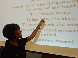
I’m not talking about classroom teachers standing and giving presentations to students, I’m talking about counselors explaining the PSAT results to students, administrators presenting to staff, staff presenting to staff and presentations to parents. We’re talking presentation that have 5+ bullet points per page, text somewhere around 16 size font, and just an overall presentation that would put the most passionate person to sleep.
I look at all these presentations and then look at the type of presentations our students create for the classroom and projects and see a direct correlation….they’re bad!
The idea of giving a presentation has changed over the years, thanks in part to books like Presentation Zen (a must read for anyone that does presentations), TED Talks, and even Keynotes by Apple, Google and other companies of late. Presentations that are based both on sound fundamentals of presenting as well as telling an engaging story.
See: Lecture as content delivery is dead
Now I understand that there isn’t anyway to make the PSAT sexy. That there is information that counselors need to give to students. I get it…but that doesn’t mean that you don’t put in the time to make the presentation something that they will actually remember.
Brain Fact:
We remember 65% more when we attach an image to information (Rule #10)
Whether that is a graph, a chart, or an memorable image. Images are the most important part of the information you should put on a slide.
Brain Fact:
We can’t listen and read at the same time (Rule #4)
Try it….try reading a book and watching your favorite movie at the same time. You either are missing the movie or you’re not reading the book. We know this…..yet we put lots of words on a slide for people to read and then talk over them or about them while people are trying to read. You are making your audience choose to either read the slide or listen to you. Worse yet is having people take notes copy word for word what is on the slide. What’s the point of this? If you want people to have the information give it to them in a handout. Unless you are assessing the skill of copying there is no reason anyone should have to copy information from a slide onto their own piece of paper. Again we can’t write and listen at the same time, so you are making your audience choose between one or the other.
Yes…you can’t make a talk about the PSAT sexy…but you can make it memorable. You can make it more likely that students will remember the information by using what we know to be brain based-research around giving presentations.
 I give a lot of presentations….and not that I think they are amazing presentations, but what they are is accessible to people. They take these facts above and apply them to a presentation that allows people to access the information, gives them space to think, and doesn’t make them choose between listening to me or reading the screen. In fact….I don’t give them an option….you’re going to listen to me because the only thing on the screen is an image and a word.
Why do we not see better presentations? Because good presentations that take these brain facts into consideration take time….take a lot of time and presenters are just not willing to put in the time to make great presentations. They get rushed, they don’t know how, or have not been taught, or have not taught themselves, and then they end up just like our students…rushed and through bullet points on a slide for your own sake and not the sake of your audience.
We then end up sitting through horrible…yes horrible presentations done by students. Students who have sat through horrible presentations and know no different so they copy what they have seen. Bullet point heavy slides that do not engage the audience in anyway whatsoever.
Presentation Tips:
-
Take every bullet point and put it on its own slide. If it’s that important of information for it to be on a slide then it should get its own slide.
-
Images, Images, Images – Find big beautiful images that help frame the point. Not some little image off to the side…but an image that fills the whole screen…that is the point, that makes the brain see the connection between the image and the content.
-
Handouts are your friends – whether they are digital or paper based doesn’t matter. Give people the information, the links before your presentation. Allow them time to look through it, get to know it, and then they will pay attention when you’re actually talking.
-
A presentation is about the presenter not the slide deck. You the presenter are the focus of the presentation not the slides. You want people to listen to what you say, you are important…the most important part of the presentation. Get words off your slides and make people pay attention to you. Nervous? Yeah…..it’s hard work giving good presentations. It’s nerve racking to know that people are actually paying attention to you and not to the 50 words on the slide behind you.
-
Expect more from our students. We need to do better for them. We do not need another generation growing up believing that a presentation is about bullet points. We can do better, we must do better. We can only expect our students to give good presentations when we ourselves are willing to take the time to give good presentations every time we have to. They are watching us….and we can do better.


Thank you so much Jeff for bringing this up once more. It is so important and so often overlooked.
I often find myself rereading Garr Reynolds tips when I prepare my presentations. He truly understands the heart of what good presentations look like: http://www.garrreynolds.com/preso-tips/design/
I just find it frustrating when I watch a presentation where the audience is totally disengaged and it seems as though the presenter doesn’t care. Especially when that audience is students.
HI Jeff,
I wanted to add the book Resonate by Nancy Duarte as a resource. I just finished reading it and am really excited by her ideas. It is less about the visuals (she has another book about the visual side, and refers to Garr Reynolds a lot as well), and more about your role as a presenter. What is your journey, and more importantly, what is the audience’s journey?
Awesome…thanks! Will look into it for sure.
Thanks for this, Jeff.
While reading your post listing bad presentations, I was constantly thinking, “yup, I do that….that too…indeed.” The reminders are quite helpful, too. My next presentation- data on MAP results (a discussion in an of itself)- will follow your guidelines.
I think an audience should have a Bingo board of some sort and during presentations they can lay down tiles on squares like “no image”, “presenter reading the slide”, “complete sentences”, etc. Perhaps you could market this and make millions….or not.
Thanks again.
Love the idea of a bingo card…if nothing else it keeps the presenter on their toes.
I take this a step further have been teaching these principals and the use of presenters notes to my students for some time now. Presenting is a skill students should be taught. I teach my students the following : Big images, Big font, 3-4 words/slide, Meaningful numbers/charts. All of which fit on their own slide based on those rules.
Totally agree…this should be taught to every student starting in 3rd grade when they give their first presentation. I just find most schools don’t actually teach presentation skills and then student rely on what they have seen….which usually isn’t very good.
Hey, Jeff – great post, and I agree wholeheartedly about the need for better presentations. Teachers in particular are bad about a number of things – font choice (Comic Sans), bullet points, too much text, primary colours (red-on-blue or yellow-on red), transitions, animations and so on. The concept of ‘Less is more’ hasn’t got through to the education sector yet! This applies just as much if they’ve moved to newer tools such as Prezi.
Tiny point, but proof-reading is important too: you’ve got a couple of surplus apostrophes in, for example, your first tip. Maybe you were using an iOS device which insists on writing ‘it’s’ even when you meant ‘its’. I’m sure that’s what happened here…
Thanks for this. I certainly don’t want my kids to rely on what they’ve seen from me. Ouch! Most of my students who use slide shows in their presentation use it as a crutch to remember what they have to say. We are getting better at using our slides as prompts to communicate orally what we want our audience to know.
HI Jeff, Enjoyed reading this post and I really want to send it out to the entire faculty of my school. As the art teacher I encourage students to use more images then words and since discovering Haiku Deck (learned about it in Singapore at Learning 2.013) I LOVE it. It is too the point, easy and beautiful.
Hi Jeff,
Yup totally agree with you. There are so many great tools like Haiku Deck and methods of presentation like Pecha Kucha 20×20 which could be taught and used in staff meetings etc so that teachers could bring the practicalities into the classroom.
I worked with some year 11 students on a Pecha Kucha style presentation for a history unit and they really struggled with removing words from their slides and just having 20 seconds per slide. I had to keep reminding them of how Steve Jobs presented, maybe this is the problem in that we do not have enough excellent role models presenting – although the TED talks are helping that, is it enough?
and we should…as many presentations as administrators, counselors and teachers give we should have a lot of role models for students.
We have all been in that terrible presentation, that makes you wish you could take all the pain of bad presentation away.
I had attended a professional development training at a school for assisting students with special needs. One of the points of the lecturer’s PD, discussed colours that created different reactions for the child. Some students need coloured glasses to help with reading, which tinted the paper to lower eye strain, and improve concentration.
This always made me think about colour choice when designing backgrounds for presentations. I tried to stay away from plain white, and often plan for light blues, greens, and pale yellows.
All learners have different ways of learning, but sometimes simple, little changes make a big difference to improve attention to your presentation.
Jeff…. Great post! I agree wholeheartedly. We tend to cater to our lowest common denominator when we “spoon feed” our audience a presentation and read it word by word. Like Anne, I too am moving towards using Haiku Deck more regularly. It forces me as a presenter to know my information more deeply and it also leads to a more interactive presentation. Participants are more likely to engage with you if they feel as if they are part of a conversation vs being on the receiving end of a lecture.
When working with students and having them use a platform, such as Haiku Deck, their choice of the image can also be included as a component of their assessment. Much more telling than listening to them read their presentation slide by slide.
[…] http://www.thethinkingstick.com/we-need-better-presentations/ […]
Jeff, Thank you for this post! I definitely agree with you that presentation skills are extremely important and that it is not taught explicitly enough to students. I think one reason that students and/or teachers may overload slides with written text is that they have not spent the time familiarizing themselves enough with the content and essentially use the slides as a script. I’ve started having students print the first attempt at their slideshow which is usually filled with written text, and that gives them the script of what they want to say. Then I have them delete the text and replace it with an image for their final version of their slideshow and emphasis the importance of practicing their talk beforehand. Obviously this takes more time and the students can be resistant but the presentations are so much better when they do this.
Excellent point. I remember in law school a professor who had close to 60 slides per class and essentially read ever slide to us. Not only boring but demeaning as well. Respect your audience and deliver the content. After all a power point that can be read and understood without your presentation isn’t a slide deck – it is a document. Just send that to your audience and spare them the pain of watching someone read to them.
Great post, Jeff! As a B2B sales manager, I’ve been developing my team with an emphasis on these skills – storytelling (what you say) and presentation zen (how you say it). I’ll be back to your blog for more “Random Thoughts”…so keep ’em coming!
Hi Jeff!I agree with about we need better presentation. we don’t need another generation growing up believe the presentation is about bullet point.
[…] 64% report learning how to create multimedia presentations but are they good presentations that take into account what we know about brain research? I’m going to guess […]
[…] 64% report learning how to create multimedia presentations but are they good presentations that take into account what we know about brain research? I’m going to guess […]
[…] 64% report learning how to create multimedia presentations but are they good presentations that take into account what we know about brain research? I’m going to guess not. Are pre-service programs and methods courses looking at what skills need […]
[…] 64% report learning how to create multimedia presentations but are they good presentations that take into account what we know about brain research? I’m going to guess […]